This post is the culmination of three different things.
- I have finally got myself organised enough to have a personal website. The framework that I’m using is blogdown which despite the name is not just for blogs. However, since the facility is available I might start blogging on matters that are of professional interest to me. While I cannot promise to keep any unprofessional rants to myself, this website will not be the forum.
- In this instance the matter of interest is the analysis of energy data. The particular instigator for this post is the following article on the occurence of zero wholesale prices in the Australian National Electricity Market.
- Earlier today I was discussing dimension reduction for data visualisation which gave me a way of checking whether this incident was truly atypical.
So here is the analysis. Everything is done using R and the purpose here is to be completely transparent about how the analysis was done.
Most of this code relies on different parts of the tidyverse package, so the first step is to load it.
require(tidyverse)The next step need to download the data from the Australian Energy Market Operator (AEMO). Price and demand data are available in csv files that have a very nicely structured URL. The beginning and end of the URL are always the same, the middle part changes depending on the month and state. The following chunk of code defines these things.
#The following is the first part of the url for each csv file.
head_url<-'https://aemo.com.au/aemo/data/nem/priceanddemand/PRICE_AND_DEMAND'

#The following is the last part of the url for each csv file.
tail_url<-'1.csv'

#This is the month we are interested in
month<-'201907'
The next step will be to create a function that reads data for each state and tidies it up a bit. The map family of functions can construct then be used to construct a big data frame containing data for all states.
download_aemo_data<-function(state){
  #This function will take a state name as input, download the data and tidy up the file
  file_url<-paste0(head_url,'_',month,'_',state,tail_url)
  file_url%>%
    read_csv%>% #read data
    mutate(TIME=as.POSIXct(SETTLEMENTDATE))%>% #Convert to date
    select(REGION, #Only keep variables we are interested in
           TIME,
           RRP)->df
  return(df)
}

#The states of the NEM
all_states<-c('NSW','VIC','QLD','SA','TAS')

#Now use map to apply this function to all states
all_state_data<-map_dfr(all_states,download_aemo_data)

all_state_data
## # A tibble: 7,440 x 3
## REGION TIME RRP
## <chr> <dttm> <dbl>
## 1 NSW1 2019-07-01 00:30:00 59.6
## 2 NSW1 2019-07-01 01:00:00 53.6
## 3 NSW1 2019-07-01 01:30:00 52.3
## 4 NSW1 2019-07-01 02:00:00 51.6
## 5 NSW1 2019-07-01 02:30:00 45.8
## 6 NSW1 2019-07-01 03:00:00 50.4
## 7 NSW1 2019-07-01 03:30:00 52.0
## 8 NSW1 2019-07-01 04:00:00 58.0
## 9 NSW1 2019-07-01 04:30:00 50.3
## 10 NSW1 2019-07-01 05:00:00 51.2
## # … with 7,430 more rowsThis could also be done with a loop, but I find the map family of function in the purrr package to be a more elegant solution. Now its time to plot a time series of price for each state.
all_state_data%>%
  ggplot(aes(x=TIME,y=RRP))+
  geom_line(aes(group=REGION,color = RRP > 0))+
  facet_wrap(~REGION,nrow = 5)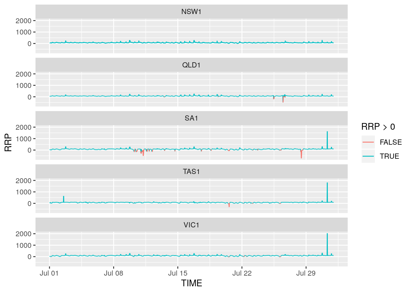
What we can see here is that rather than zero prices, some periods are characterised by negative prices. To highlight this color has been added; negative (or zero) prices are red and positive prices are blue. Negative prices often occur when supply from renewables is high and demand is low. They imply that generators are willing to pay wholesalers to use the electricity they generate.
The following code can be used to filter out observations where prices were negative in all states. First we spread the dataset from long to wide
all_state_data_spread<-spread(all_state_data,REGION,RRP)Then check if there are any observations for which all numeric variables are less than 0.
all_state_data_spread%>%
  filter_if(vars(is.numeric(.)),all_vars(. < 0))
## # A tibble: 0 x 6
## # … with 6 variables: TIME <dttm>, NSW1 <dbl>, QLD1 <dbl>, SA1 <dbl>,
## # TAS1 <dbl>, VIC1 <dbl>As you can see it returns nothing which indicates that there was no period where half-hourly spot prices all dropped to zero or lower simultaneously across all states. Have I uncovered some sort of greenie conspiracy involving the Guardian?…
… Well, no. The spot market data used here is at a half hour resolution and is in fact an average of the 5-minute spot prices. Perhaps prices fell to zero for one 5-minute interval within the half hour and this information was lost by taking the average. Perhaps restricting attention to periods where spot prices dropped below $10 will reveal something.
all_state_data_spread%>%
  filter_if(vars(is.numeric(.)),all_vars(. < 10))
## # A tibble: 3 x 6
## TIME NSW1 QLD1 SA1 TAS1 VIC1
## <dttm> <dbl> <dbl> <dbl> <dbl> <dbl>
## 1 2019-07-20 13:00:00 7.46 6.67 -22.6 -46.7 -9.94
## 2 2019-07-21 12:00:00 2.98 2.8 2.32 2.31 2.52
## 3 2019-07-21 13:30:00 7.05 6.44 5.39 5.58 6.08That first row looks promising, although prices for QLD and NSW are positive they are quite low. Indeed at 13:25 on July 20, 2019 spot prices in all five markets dropped to or below zero. This can be seen by downloading this zip file and navigating yourself to the right place. Perhaps using the 5-minute data is something I will do at length in a future post.
Finally, as promised, an alternative way to visualise these data. With five states, the data are five-dimensional. Unfortunately we cannot do a five-dimensional scatterplot. We can however plot the first two principal components of the data. When it comes to dimension reduction principal components really are an oldie but a goodie. The following code carries out PCA
all_state_data_spread%>%
  select_if(is.numeric)%>%
  prcomp(scale. = T)->pcaout
summary(pcaout)
## Importance of components:
## PC1 PC2 PC3 PC4 PC5
## Standard deviation 1.7481 1.1182 0.58318 0.52551 0.27801
## Proportion of Variance 0.6112 0.2501 0.06802 0.05523 0.01546
## Cumulative Proportion 0.6112 0.8613 0.92931 0.98454 1.00000About 80% of the data is explained by just the first two principal components. These can be plotted so that each dot refers to a point in time and in this way anomalous time periods can be seen. Two more packages will be used here. The first is broom which is used so that the output from the prcomp function can be coereced into a data frame. The second is plotly which is used to create an interactive graphic.
require(broom)
require(plotly)
all_state_data_spread%>%
  mutate(AveragePrice=(NSW1+VIC1+QLD1+SA1+TAS1)/5)%>%
  augment(pcaout,.)%>% #Add PCs back to data frame
  ggplot(aes(x=.fittedPC1,
             y=.fittedPC2,
             col=AveragePrice,
             label=TIME))+
    geom_point(size=0.8)+
    scale_color_gradient2()+
    theme_dark()->g
ggplotly(g,tooltip = 'label')
To add a bit of colour, the average price is also portrayed with high average prices shown in darker shades of blue and low average prices shown in red. Prices close to zero are in lighter shades.
The plot above shows that higher prices are generally associated with the right hand side of the plot and lower prices with left hand side. Looking at the weights used to form the principal components shows that the bottom of the plot is associated with low (negative) prices in South Australia, Tasmania and Victoria while the top left hand side of the plot is associated with low (negative) prices In Queensland and NSW. Hovering over the points shows that the half hour period where all prices momentarily hit zero does lie towards the outside of the distribution. However it is by no means atypical, some other observations are in a similar region.